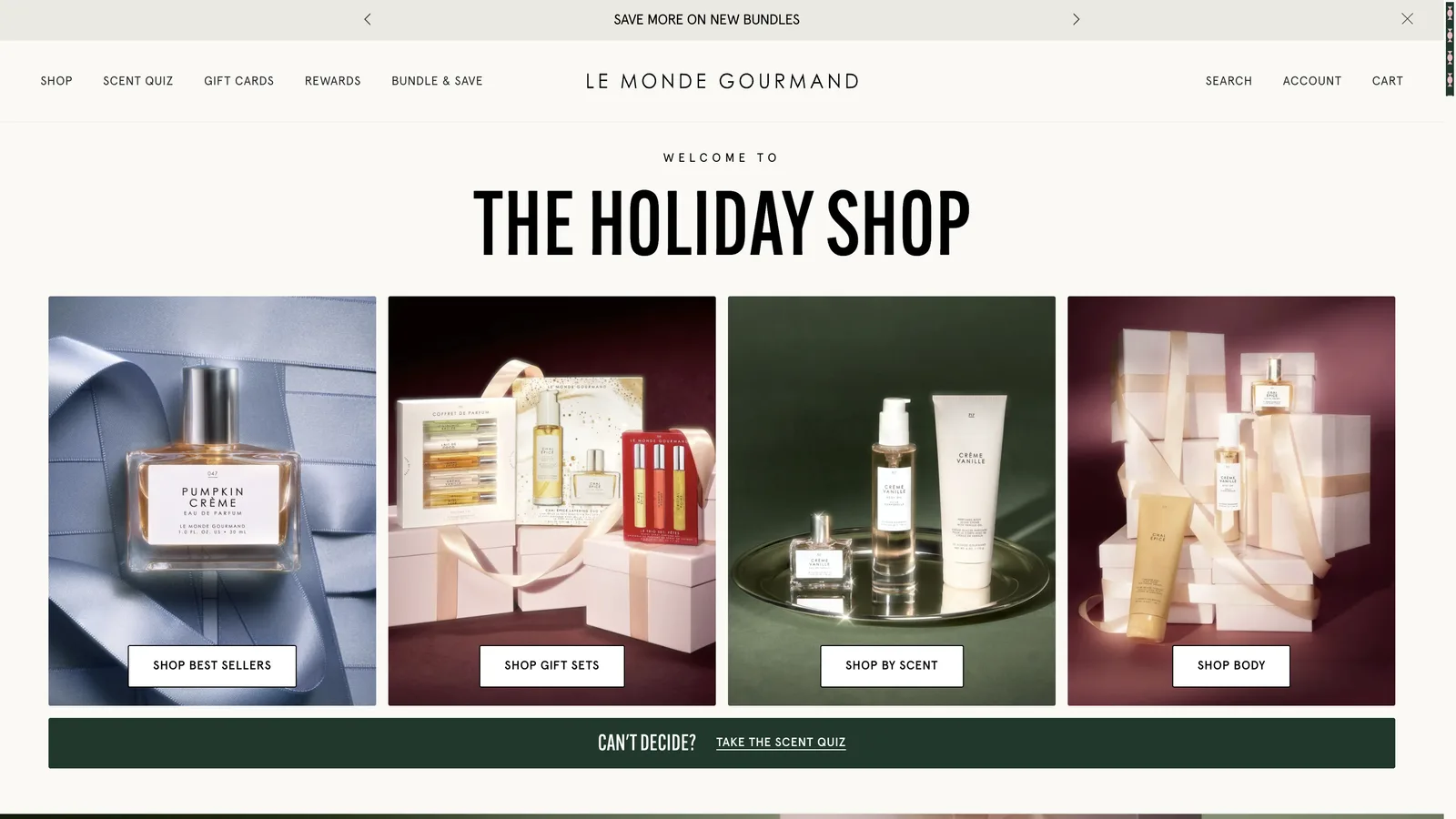
Le Monde Gourmand, retailing as Gourmand Beauty, is the gourmand fragrance brand inside Tru Fragrance + Beauty. The holiday brief was a shop page with a different personality from the Tru Western guide: brighter, editorial, built around sets and layering, with a loyalty-exclusive launch and a bundle offer at its center. Both pages were designed and built in parallel, from the same checklist, and launched the same evening.
I ran the whole thing: design rounds with the brand’s creative and e-commerce teams, the responsive prototype, the Liquid build on the live theme, asset preparation, QA and the push to production.
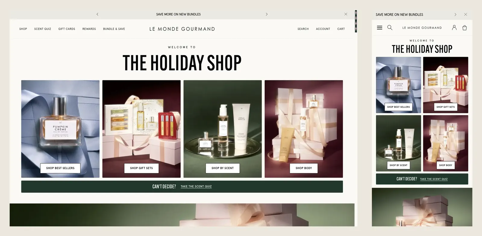
Design decisions that survived four rounds
The quick finder went to image tiles (the Tru Western page uses pills), with the title and the four tiles above the fold on every desktop size and a two-column grid on phones. The rows of products scroll on mobile with a visible peek and a thin indicator; the finder itself never scrolls.
The merchandising logic came from the brief and from the store’s own mechanics, not from the page:
- The launch product is loyalty-exclusive. The block reads the store’s “loyalty exclusive” product flag: a logged-in member sees the product and its button, a visitor sees “Join Rewards to shop” and “Already a member? Log in”. The product page itself stays unlisted until the brand publishes it.
- The bundle offer shows the store’s buy-more-save-more tiers (two, three, four, five or more) and hands off to the bundle builder, so pricing is never duplicated in the page.
- The scent section is the store’s own “Shop by Scent” block, curated to four tabs for the season, rather than a copy of it.
Motion was tuned to the brand’s taste after a review: the smooth-scroll layer and the parallax were removed at their request, the page scrolls natively, and the remaining motion is entrances, hover states and the countdown. Fine, because it was all section settings.
The build
Nine lp- sections plus the store’s own featured-collection section, with a shared card and a shared quick-add snippet that goes through the theme’s add-to-cart path. That mattered here: the cart drawer opens with the loyalty gift-with-purchase banner and the recommendations the store already runs.
Every photo slot has its own framing settings (desktop and phone files, zoom, position) and optional highlight points, small sparkles placed on the photo by coordinates in the editor, with separate points for the phone crop. Default values came from the approved mockups, so the page looked right on day one and the team could still move everything.
Images are served through an lp-media snippet that writes sizes from the slot and the framing zoom. The 18 final photos went to Shopify Files through the Admin API with SEO file names and alt text, then were assigned to the template from a manifest, with each file checked against the pixels its slot needs at 1440@2x and 390@3x.
{%- comment -%} Loyalty gate, simplified: the flag lives on the product, the decision in Liquid {%- endcomment -%}
{%- assign gated = product.metafields.loyalty.exclusive | default: false -%}
{%- if gated and customer == null -%}
  <a class="lp-btn" href="{{ section.settings.rewards_url }}">Join Rewards to shop</a>
  <a class="lp-link" href="{{ routes.account_login_url }}">Already a member? Log in</a>
{%- else -%}
  {%- render 'lp-atc', product: product, variant: product.selected_or_first_available_variant -%}
{%- endif -%}
Measuring before shipping
Before the preview went to the client I ran Lighthouse three times per page, mobile and desktop, and kept the medians next to the store’s own home page. The useful part was separating what was ours from what was the store’s: axe reported zero issues inside the page’s sections, the main-thread cost on mobile came from the store’s apps, and the page’s own script sat well under them. Those numbers went into the launch notes so the team knows where the remaining performance budget actually is.
Launch
A preview theme built from a fresh pull of the live theme plus the new files, shared with the team for their edits. Launch day: the preview was re-pulled, the 17 code files verified identical to the repository, the team’s template taken exactly as they left it, and 18 files pushed to the live theme with --only and --nodelete. Checksums before and after: 17 new files, one snippet updated (the page’s social card), the other 491 files untouched. The page was created with its template, search title, description and share image, and checked as a new visitor at five viewports: no Liquid errors, no overflow, 31 images with alt text, 42 links answering 200, quick add working on desktop and phone.
What this project shows
Two brand pages from one process, shipped on the same evening, each inside its own live theme, each fully editable and each with a documented, reversible deploy. The loyalty gate and the bundle tiers are the parts I would point a merchant to: the page respects the store’s rules instead of reimplementing them.