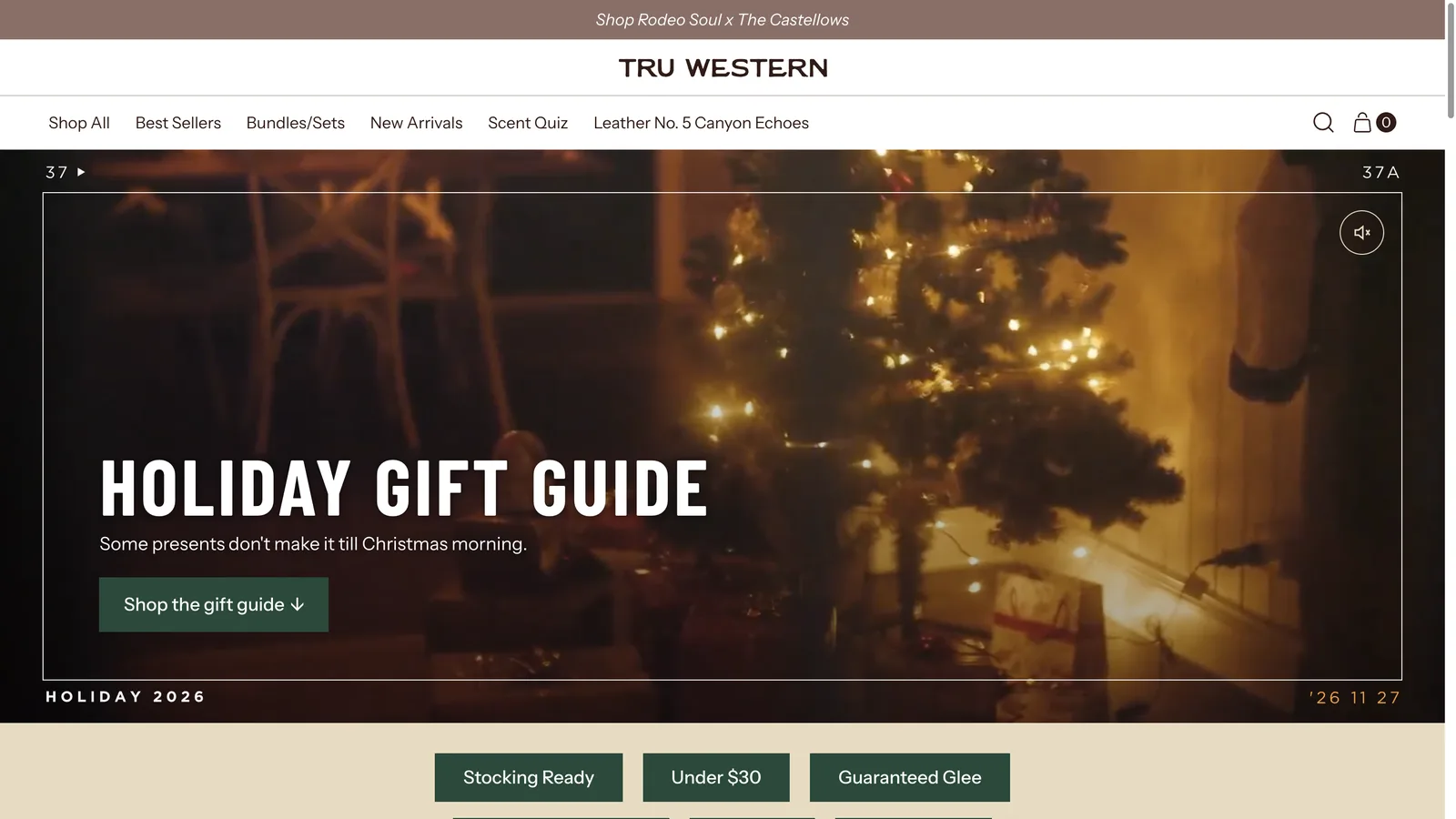
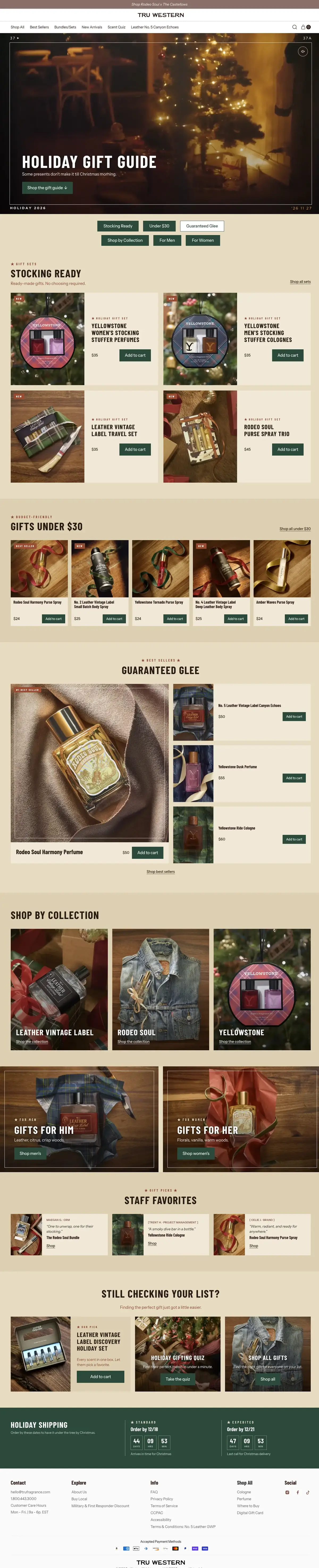
Tru Western is the western fragrance brand inside Tru Fragrance + Beauty, on Shopify Plus. For the 2026 holiday season the brief was a gift guide that would carry the campaign video, six ways to shop (stocking stuffers, under $30, guaranteed hits, collections, for him, for her), staff picks, a quiz hand-off, and the shipping cutoffs, without touching the store’s header, footer, cart or apps.
I owned it from the first wireframe to the live push: design rounds with the brand’s creative team, a responsive HTML prototype, the Liquid build on the live theme, QA as a new visitor, and the launch.
Design, with the fold as the first constraint
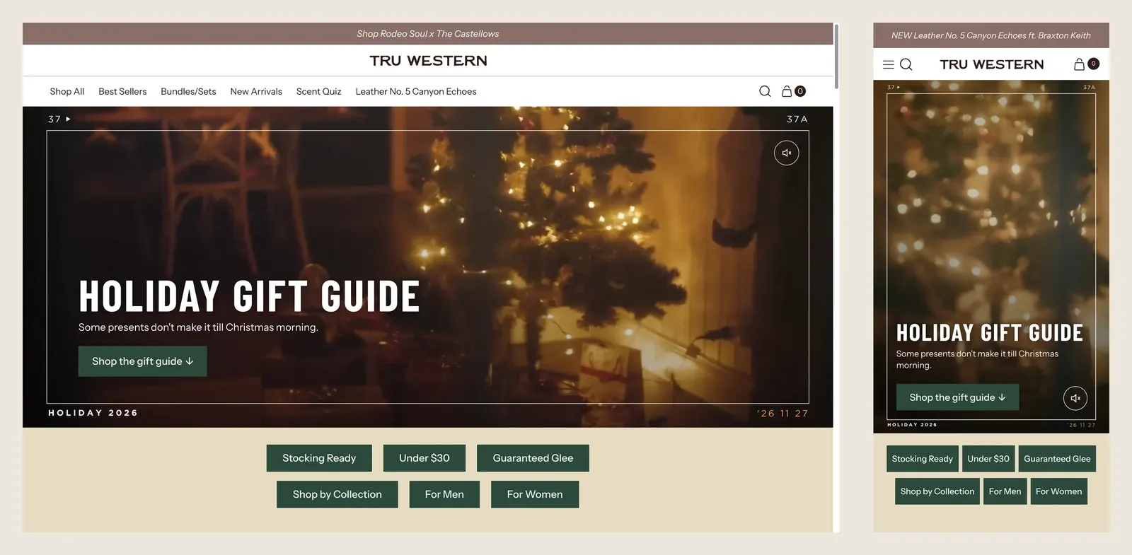
The page went through four rounds in Figma with the brand team. The biggest design decision was not visual, it was the fold: the hero video plus the six quick-finder pills had to be visible on the first screen on every common viewport, so people could choose how to shop before scrolling.
I settled that with measurements instead of ratios. A test copy of the page, with the real video in place and a small overlay that prints the viewport size and where the last pill ends, was served on the LAN and opened on two iPhones and at real window sizes on a Mac. The result became a rule written in svh, so Safari’s toolbar is accounted for:
/* Hero height: fill the first screen, leave the pills visible.
   --lp-above is the hero's real offset, read at runtime, because the
   theme's header-height variable over-reports when the bar is compact. */
.lp-hero {
  height: max(calc(100svh - var(--lp-above) - 236px), min(33.33vw, 52svh));
  max-height: 56.25vw; /* never taller than 16:9 */
}
@media (max-width: 749px) {
  .lp-hero { height: calc(100svh - var(--lp-above) - 120px); max-height: 150vw; min-height: 360px; }
}
Measured heights at 1366×658, 1440×900, 1920×1080, 768×1024, 375×620, 390×844 and 440×796 went into the project notes, and the Figma frames were set at the same reference windows so the client reviewed what the browser would actually show.
The build: Liquid sections, nothing hard-coded
Everything lives in the store’s own theme as new files. The page is a template with nine sections, each named by its layout rather than by the campaign, each with a full schema and a preset:
lp-framed-hero: image or video per breakpoint, film-frame SVG layers (top, bottom, end card) for 16:9 and 9:16, a brand seal, first-frame posters, sound toggle.lp-pill-finder: the six anchors, with the active pill following the section in view.lp-product-grid: three layouts (pairs, row, lead) sharing one product card.lp-collection-tiles,lp-split-panels,lp-quote-cards,lp-pick-and-links,lp-star-divider.lp-shipping-countdown: cutoff per shipping method, editable, with a live countdown that switches its message after the date.
The product card reuses the theme’s AJAX cart contract, so “Add to cart” opens the store’s drawer with the free-sample picker, the gift-with-purchase logic and the tracking pixels exactly as on any other page. Images go through an lp-image snippet that computes sizes from the slot and the framing zoom chosen in the editor, so a zoomed photo requests a file with enough pixels at 2x and 3x.
Motion is CSS and a small vanilla script: hero entrance and parallax, cascading section reveals, a star divider that draws itself, countdown digits that roll. It is off under prefers-reduced-motion and inside the theme editor. On desktop, a smooth-scroll layer carries the anchors to an exact pixel under the compact header, and it stops whenever the store locks scroll for its cart or search.
The brand team then edited the page themselves before launch: product picks, staff quotes, photos, copy. The build gave them the controls; the final template is theirs.
Assets and launch
Final photography arrived as crops from the brand’s creative team. I checked each file against the pixels its slot needs at 1440@2x and 390@3x, re-cut the five that were under from the graded masters at the same framing, and uploaded 28 files to Shopify Files through the Admin API with SEO names and alt text, then assigned them to the template from a manifest.
The launch was a surgical push: 26 files only, staged alone, shopify theme push --only … --nodelete onto the live theme. Full-theme checksums before and after proved that 25 files were new, one snippet changed (the page’s social-card block, additive), and the other 464 files were untouched, including the homepage template the team was editing at the time. The page was created in the admin with its template, search title, description and share image, and QA’d as a new visitor at 1440, 1280, 820, 390 and 360: no Liquid errors, no overflow, 24 images with alt text, 27 links answering 200, hero video playing on desktop and phone, quick add opening the cart on both.
What this project shows
Working inside a live Shopify Plus theme with the discipline of a production system: a schema for everything, no content in code, a reproducible deploy with evidence, and a design that was decided with measurements on real devices. It is the opposite of the subdomain approach I used for the Rodeo Soul Harmony launch, and I prefer this one for a campaign that must live inside the store.